Mobile Websites Are Important
Why You Need Your Website To Be Mobile Friendly
A mobile website is an important strategy for every brand in 2020. Why so? Mobile devices are revolutionizing the way people connect, and that’s why businesses need to operate in that way. If you look around, you’ll see most people glued to their mobile screens. Mobile devices are the majority of web traffic drivers in 2020.
A mobile phone is not only a digital transformation, but it will change the way businesses are running. These devices are a bridge that is filling all the loopholes in the physical world. In short, you need a mobile-friendly website. In this article, we’ll take through all the things about mobile websites.
Apart from learning about mobile websites and how they’re important, we’ll also discuss some great mobile website designing tips. Plus, you can also check out the best mobile-friendly websites and take some inspiration from them. Let’s not waste more time and get going!
What Is A Mobile Website?
If you are planning to open a website for your business, you may not be aware of the term mobile-friendly websites. A lot of website owners still have misconceptions about a mobile website. Simply putting forward, a mobile website is a web page that is optimized and designed for small devices. These devices are mainly tablets and smartphones.
Creating a mobile responsive design means customizing a website that can optimally adapt to the screen size. The mobile website is very different from desktop websites. The arrangement of logos, images, and texts are carefully rearranged so that it is readable on mobile devices.
The elements on a mobile website will seem like they’re stacked upon each other. The space around the text or images is more compact. The buttons are large for enabling the user to make quicker taps. The mobile websites have an interactive and rich experience that has set higher standards for digital media.
The Importance Of A Mobile Website
Let’s skip the chit-chat and get to the real point. In the year 2019, 52.6% of website traffic was generated by mobile devices. That is quite an amusing number. This implies that smartphones or mobiles are dominating desktop and PCs. You should also know that the number of mobiles is expected to touch 16.8 billion units in the next three years.
Moreover, mobile phones are also altering the chopping patterns of consumers. Google claims that a whopping 59% of buyers prefer online shopping on mobile phones. Even when people are shopping at retail outlets, they tend to search for the product on the web before making a purchase. Even Google’s very own algorithm prioritized mobile websites in their search engine results. Considering everything, people have become mobile-first, and that's why you need a mobile website.
Mobile Website Designing Tips
Now that you are all aware of a mobile website, you're ready to explore some great mobile website designing tips. Check out these eight brilliant tips that will help you to create awesome mobile websites for your brand.
Create Eye-Appealing CTAs
CTA is an abbreviation for call-to-action. The CTA can be a banner, image, or even text. This specific element motivates the user to take up some actions. For instance, the CTA can consist of a text that calls the users to subscribe to your mailing list.
You can also put up some offers or buy a product text on the CTA. This is a marketing strategy that plays a vital role in mobile website design. Before anything else, you should know that making a call-to-action is not as easy as you think.
Don’t Forget “Contact Us”
Often website owners forget to prioritize the “contact us” section. This section is very important to keep your buyers or visitors connected to you. If the customer is looking to contact you, there’s a possibility that they require help. Since the customers might be already in agony due to their problem, don’t add fire to the fuel by making it challenging to get in touch.
A lot of shoppers believe that customer service is a key feature of a good brand. Make the contact section more visible. Try to include things like live chat to make your mobile website more interactive.
Forms Should Be Easy
A lot of website users prefer filling long forms only through PCs or desktops. It is also easy to type long texts on big devices. When you are viewing a website on a mobile device, then it’s more feasible to fill short forms that have big fonts. For instance, if you’re asking the user to subscribe to the mailing list, don’t add more columns other than name or email.
Make The Button Big
A mobile website should have big buttons to ensure that the users can click on it without zooming or struggling. Also, don’t forget to add the space between hyperlinks and anchor texts. When two hyperlinks are placed too close to each other, then the users might get perplexed. Keep the text spacing and everything else in mind while designing your mobile-friendly website.
Simplified Menus
Will you like to go through intricate menus on your mobile phone? Of curse not! Desktop websites can have long menus because there is a larger space. The menus can take up the entire top portion and have lengthy drop-down choices. You have big menus on desktop websites without hindering the website experience.
When it comes to mobile websites, you’ve to keep it short and crisp. The menus should present an overview of the entire website in a small space. The buyers can use the filters, categories, or the search bar to narrow down what they’re looking for. A mobile website generally uses a hamburger symbol.
Skip The Pop-Ups
Nobody ever said that they love pop-ups, then why to include them on your mobile website? This is one of the reasons which Google made some hefty changes in their algorithm in 2017. This new algorithm penalizes many websites that use some specific-type of irrational pop-up ads on mobile websites.
The Search Feature Should Be Intuitive
One of the most important features of mobile surfers is the search bar. Since you cannot have intricate menus on your mobile-friendly website, therefore, the search bar should be precise. It can make the browsing experience much more seamless and positive. The best place for the search bar is the center and front portion.
The Text Should Be Large
It is very difficult to read long texts on cell phones, especially when you have to keep zooming. This designing tip is pretty obvious. It is crucial to use an optimal font for your mobile-friendly website. Choose a font size that will not make the readers or buyers zoom in.
Moreover, the text should fit the screen size properly so that the users don’t have to scroll left and right. If you want to engage your users in the right way, the fonts and the texts should be your priority.
The Best Mobile Websites Of 2020
You have gone through the designing tips and the importance of a mobile website design, and now it’s showtime. We have included some bang-on mobile-friendly websites that have changed the way people use websites. More and more businesses are focusing on developing a delightful mobile website.
Google also heavily favors mobile websites as opposed to desktop websites. It has also started indexing mobile websites since 2018. To help you in the process of creating a mobile-friendly website, we’ve picked the top mobile websites that will be a great source of inspiration. Check out the list below, and don’t forget to take some valuable ideas from them.
ABC
ABC is a broadcasting firm that is popular for shows like General Hospital, The Bachelorette, and The Rookie. All the users that visit the ABC website are greeted with many options. You can check the broadcasting schedule and the recent Emmy award winners on their website. ABC is one of those sites that has been receiving heavy-traffic from mobile devices.
The dark backgrounds of the website deliver a theatre-like experience for the users. Users can easily scan and search for their favorite shows on the website. You can filter through the content based on alphabetical order or genre. The categorization has been done perfectly so that users can find their beloved shows easily.
Adrian Zumbrunnen
We are talking about the personal website of the popular writer and designer Adrian Zumbrunnen. If you are visiting his website for the first time, the first thing that will catch your eye is that it’s interactive and conversational. The website has a text message conversation-like feel. The users are provided with two responses at the end of every deal.
The mobile and desktop website is very similar. Even the desktop website will give you the impression that it was created essentially for mobile screens. Overall, the design is simple yet very approaching.
Buzzfeed
Most of you would’ve expected to see this name on the list. BuzzFeed’s mobile website is one of the best ones to date. No, it’s just not the content we’re talking about, it’s the placement of image, text, and the total layout. BuzzFeed is well aware that most of its traffic is generated from mobile devices.
They’ve gone to a great extent to deliver a smooth and fun experience for their daily readers. When you first land on the BuzzFeed website, you can spot the top contents presented in a simple format. They’ve also tried to customize and serve all types of audiences through their simple menu.
Elf On The Shelf
This mobile website design is a recent Christmas tradition that is based on a children’s book. The concept of the website is very holiday mood. The book entails the story of Santa’s elves that are responsible for keeping n eye on all the children and reporting it back to Santa. The parents can purchase the elf figurines along with the Christmas-themed book.
The website features numerous kinds of Elf On The Shelf merchandise. The mobile website doesn’t force you to scroll through all the products. The mobile website designers have packed each product range into large tiles that display the goal of the buyer's journey. This kind of layout is perfect for mobile users, and it also leaves an impactful impression on the users.
Etsy
Etsy is undeniably a shoppers paradise. Apart from it’s an adorable and vast range of products, people also like to shop on their mobile website. The main aim of the mobile website is to cater to all kinds of buyers and sellers. Most buyers on the website generally come to search for a specific product or for simply browsing items.
The mobile website caters to both kinds of buyers from the beginning of their website. When you first visit their mobile website, you will be able to spot an option that allows you to search for specific categories, shops, or products. Just below the search bar, the website sports thumbnail images of trending products.
The trending items are laid out in college format, and the thumbnails are big enough so that you can tap them easily. The website has perfect font size, colors, and text spacing, which gives all elements on the page a breathing space. The products and texts are not stuffed or overly-packed, which is good.
Evernote
Evernote is one of the most useful tools for both professionals and educational backgrounds. The first thing that grabs the eyeballs is the color scheme, font, and overall layout. The Evernote mobile website colors have to stick to similar colors as the ones in its logo. The company’s website is simplistic and doesn’t distract users from the main aspects.
If there’s something that should receive credit for the successful mobile website, then it’s their call-to-action banner. The positioning, size, and color of the CTA are all in sync. The website also features a simple menu that is not very confusing.
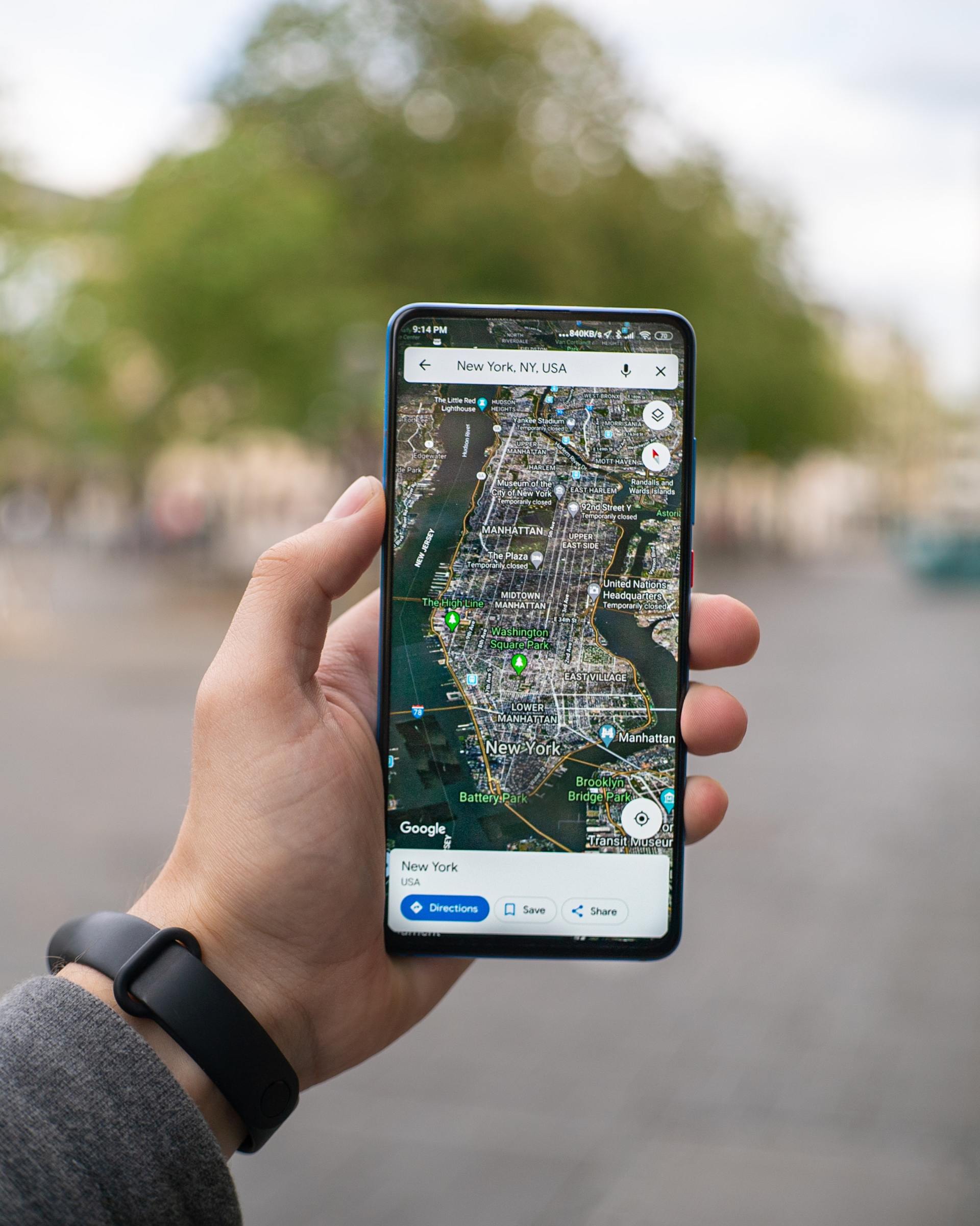
Google Maps
When it comes to the world of the internet, no one does it better than Google. Google map is a perfect example of a smart mobile website. Google maps can be used while walking, biking, driving, or when you’re riding in public vehicles. The unique part about the Google Maps mobile website is that it is almost a carbon copy of its mobile app.
The mobile website doesn’t only have the same buttons and features, but it also has an excellent speed. Most people will find this mobile website easy-to-use and not too complicated. Google Maps has done an impeccable job of making maps simple for mobile websites.
Huffington Post
The list of best mobile websites will be incomplete without Huffington Post featuring in it. The Huffington Post is a popular news website that updates everything from entertainment and politics to technology and current events. The unique thing about the post is that they slightly tailor the headlines for their mobile readers. If you compare both website versions, you’ll notice that the mobile website has fewer texts on the homepage. The headlines are easily readable and digestible for the readers. It’s perfect for their on-the-go readers.
You can easily skim and read their content on your mobile device. On the Buzzfeed mobile website, you will also see a clickable menu on the left-hand side. The menu includes several categories that the readers can choose according to their interests.
Express
The Express website is a clothing store that targets young women and men. Since their website is dedicated to browsing clothes and apparel, their images are big and visible. Especially when it comes to mobile websites, the image size is perfect for enabling the users to have trouble-free online shopping.
Express has taken its mobile website a notch higher than other clothing retail websites. If you slide from left to right across the image, then it will change and portrays a different angle of the clothing. The users don’t have to go through the burden of loading multiple webpages for viewing all the images of the same product.
KISSmetrics
The KISSmetrics deals in analytical software as a part of business solutions. On their homepage, they’ve covered a lot of information explaining their services along with client testimonials. Their mobile website is somewhat different from that. If you view their website through your mobile, you’ll see all the information in the form of a list.
The alternative light and dark modules make it easy for users to skim through their website. The forms are simple, and the text on them is large enough to read. All in all, this KISSmetric website is one of the perfectly designed platforms for mobile screens.
Lean Labs
Lean Labs is one of the greatest marketing agencies that are into creating highly-engaging and responsive web solutions. They also featured on the popular show Shark Tank. These folks are doing an impeccable job of creating user-friendly mobile websites. Their “10x formula” seems to be the secret of their smart website design.
This mobile website uses typeface, scale, and contrast to differentiate the elements of the webpage. The subtle image of the mountains is adding a sense of calmness and activeness to the webpage. Lean labs are not only the best marketing agency but also has an amazing mobile website.
Pixelgrade
If you are looking for some great inspiration for your mobile website, then you should look at the Pixelgrade website. The Pixelgrade’s tile theme allows the users to properly go through the portfolio and services of the brand. The layout is optimized for mobile phones so that the users can efficiently scroll through the page. The website delivers the brand message effectively without compromising aesthetics.
The colors on the homepage are very attractive and apt for mobile screens. The layout is simple yet spacious. The big banner you see on the homepage serves as a call to action. Their mobile website is unique and smart.
SAP
SAP is a software company that handles customer relations and business operations. The brand enhances the experience of its mobile users by condensing the content. It has innovatively put all their information into an interesting video that can be played right from the homepage. Furthermore, SAP has combined many of its CTAs in the form of sliders.
This enables SAP to keep their mobile website easy to read as well as resourceful. You will not feel overwhelmed by the amount of content because of the way it’s presented. The size and font of the CTA are perfect. The contact section has been prioritized, and you can instantly get in touch with them through the "text SAP" option.
Shutterfly
Shutterfly is an online brand that allows people to create personalized cards, stationery, photo books, and many more things. Since more people are taking photos from smartphones and uploading them to Shtteryfly through mobiles, Shutterly recognizes the need for a mobile-friendly platform.
The main of the website is to offer a user-friendly experience and use beautiful images for showcasing their products. When you visit Shutterfly’s mobile website, you can see the latest deals and promos right in the center. It also features a finger-size button for signing in.
When you scroll down, you can see an array of products with large buttons. When you click on one of those buttons, Shutterfly opens up large images so that you can check the product. Shutterfly is increasingly entertaining a huge amount of online traffic due to its great range of products, and it’s a mobile-friendly website.
The Bottom Line
As more and more smartphone numbers are rising, all brands and their websites are acknowledging the need for mobile websites. Having a mobile website for your brand can bring in greater benefits than you think. You shouldn't be throwing away your mobile visitors like that, it’s time to cater to everyone.
Make sure you follow our mobile website designing tips if you are still confused about the layouts. You can also check out these mobile-friendly websites and pick up some advice from their design. In 2020, all websites must upgrade themselves for a mobile-friendly view.
Need Help with a Mobile Website? Let Us Know. We Can Help.


